What Bridge Theatre gets right about website UX
I don't want my website to surprise me
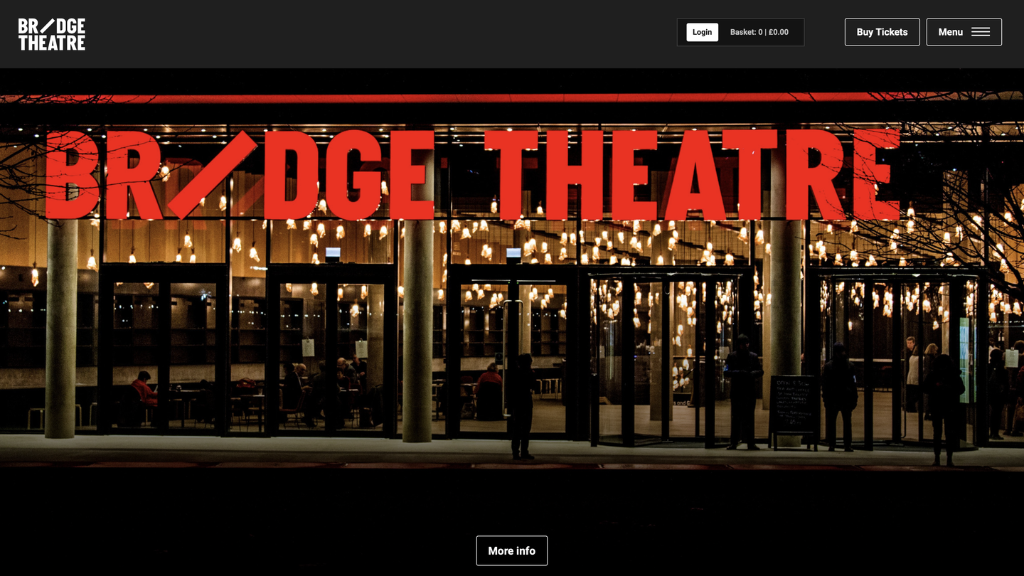
One of the first things you notice when you visit the Bridge Theatre website is you know exactly what the website wants you to do. It wants you to buy a ticket to a show.
With multiple teams having input into a website, it can be easy to lose track of priorities. The HR team wants you to know about their new hire; the PR department want to talk about the new show they've commissioned focused on the trend everyone's talking about.
It takes an act of generosity to the user to put that information and those stories into secondary navigation, to make it available for the curious, and to make way for the thing people really visit theatre websites to do.
I've recorded a five-minute review of the website, highlighting some of the interactions I enjoyed.
Chief among them is that the website asks very little of me. It doesn't want me to sign up to a newsletter, or even to accept cookies before I start the booking process. There's no carousel and no flashy animations to show off how creative the web team are.
It wasn't a surprise to discover that the website was designed and developed by Substrakt, the Brummie agency devoted to the cultural sector... and for whom I was Technical Director for a bit (although not since 2016 so I take 0 credit for any of their work today).
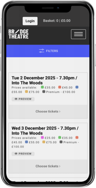
As you move into the ticket-buying stage, the user experience and branding is similarly uncluttered (as much as it can be). The logo animation is the only hint you're out of the WordPress environment and into Viadukt, Substrakt's proprietary and accessible ticketing pathway. But because the website is built by the same people who make the ticketing UI, it's pretty seamless.
This site is indicative of a lot of Substrakt's design: clean, accessible, and user-focused. I'm not surprised by anything (this is a good thing), and I know what I should do next.
Textbook.