Shut up and take my money!
When websites ask for too much info they don't need, they lose out on potential sales.
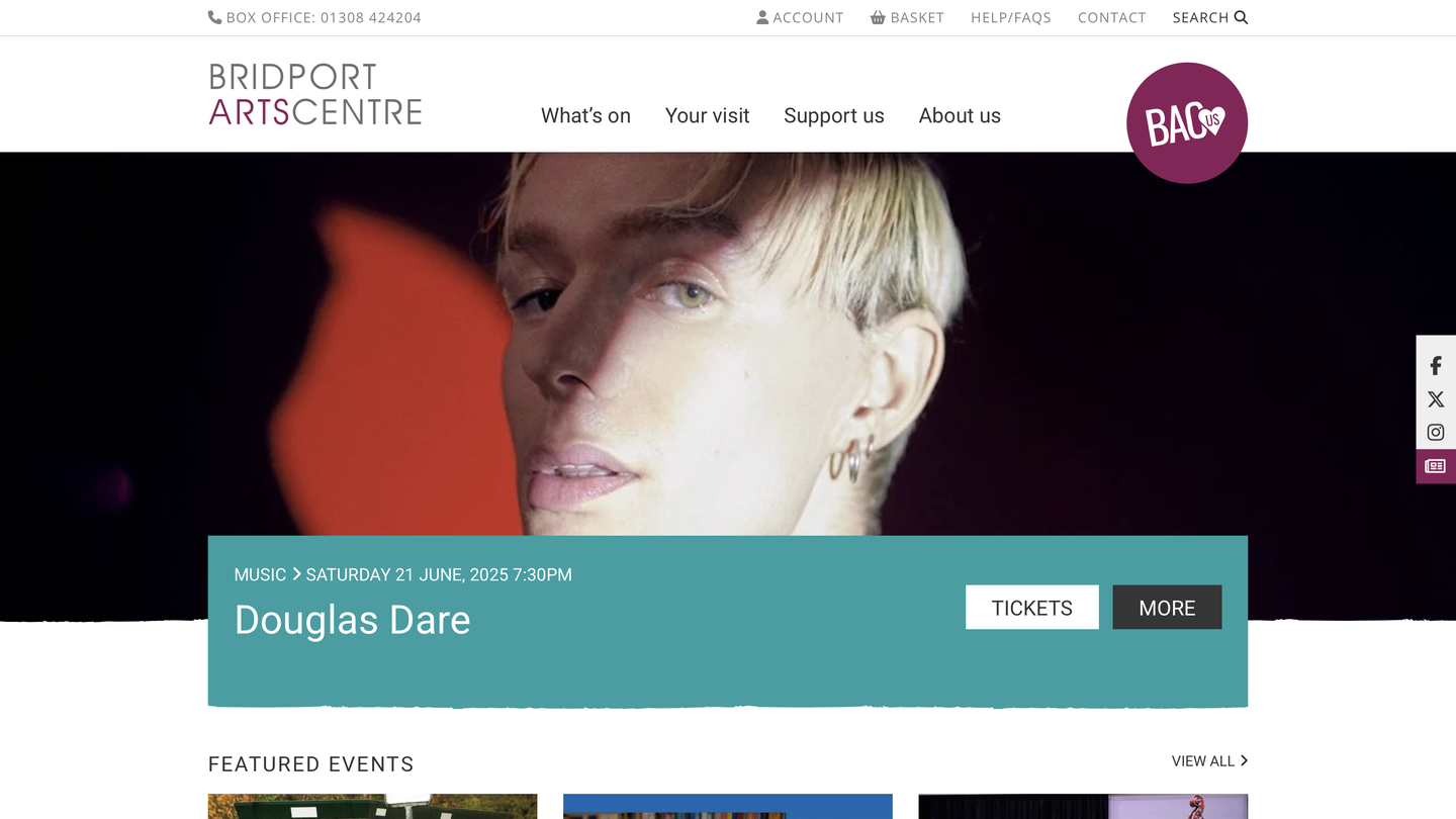
Listen, I can't love every website I come across. And really, I have no beef with Bridport Arts Centre, but their site makes a couple of key mistakes I doubt have been given much thought, but that can be the difference – to a busy person – between a ticket sold and an opportunity missed.
In my last review, I praised the site for its clear signalling of what they want me, the customer, to do. While Bridport's flow is still clear, the big "BAC US" badge is one of the first calls-to-action you encounter, which speaks to teh competing priorities that exist between cultural organisations and their service users.
If I've heard about an event through Instagram and I turn up at the website, I want the flow to be seamless and easy – especially on a phone. And Bridport's is not an unpleasant experience, but it does make one key mistake. Here's my five-minute walkthrough:
If I'm scrolling through my phone at the doctor's office and I see an event or an exhibition I like the look of, the quicker you can get me through the checkout process, the more likely I am to complete the order.
Otherwise I'm going to be stuck filling in demographic information (like date-of-birth, which is useless to the buying process), my doctor's going to call me in, and I'm going to go home having forgotten I'd started picking a seat.
What information you ask for – and when – are crucial in creating experiences that bring people back.
A venue's website is often the first way a new visitor interacts with that venue, so there's a real opportunity to guide the visitor through from seat booking to payment info (asking only for billing info and an email address), to the welcome email before the event, to the "thanks for coming" after the event that encourages the visitor to become a patron while goodwill is at its highest.
There are often a million and one reasons why user interactions like this don't happen on websites, so I'm not pointing fingers at anyone. After all, no-one sets out to make a rubbish user experience.
And to be clear, Bridport's isn't rubbish by any means... it just provides an opportunity for us to go one better when building our own customer journeys.